← Back to Work
Mobile App
Social
Case Study
Happenings.
A community-focused event planning app designed to make gathering with the people you love feel effortless again.
Overview
Happenings is a community-focused app designed to simplify the process of planning and organizing gatherings. In a post-pandemic world where meaningful connections are more important than ever, Happenings streamlines the planning process — fostering a sense of belonging, connection, and community.
Problem
After the pandemic, gathering felt harder than it should.
One of the biggest challenges people faced post-pandemic was relearning how to connect. Relationships are a basic human necessity — and a lack of meaningful connection directly correlates to a lower quality of life. Yet planning a gathering remained overwhelming, fragmented, and stressful.
80%
of respondents have hosted a small gathering
64%
interested in food, mood & music pairings
97
adults surveyed across 10 questions
Process
01 Discover
→
02 Define
→
03 Ideate
→
04 Design
01 — Discover
We started with a wrong assumption.
Initially, we assumed a need for a drink-mixing app. But after surveying 97 adults and conducting 8 semi-structured interviews, a different unfulfilled need emerged — people didn't want better cocktails. They wanted better gatherings.
"There is less interest in mixing drinks at a party, and more interest in creating an environment where guests feel comfortable and happy."
Survey
97 adults (ages 21+), 10 questions on gatherings, community, and social habits.
Interviews
8 semi-structured interviews (ages 21–36) to drill down on specific feelings and viewpoints.
Competitor Analysis
Reviewed Partiful, Evite, Pinterest, Big Night, and Make Me a Cocktail to identify key gaps.
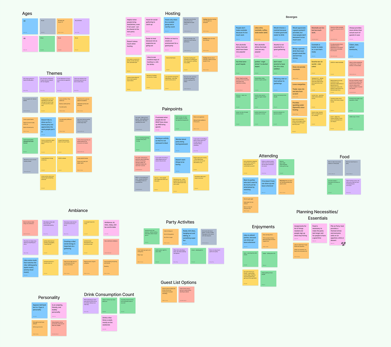
Affinity Map
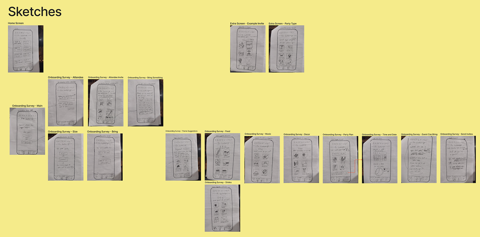
Sketches
02 — Define
What people actually needed.
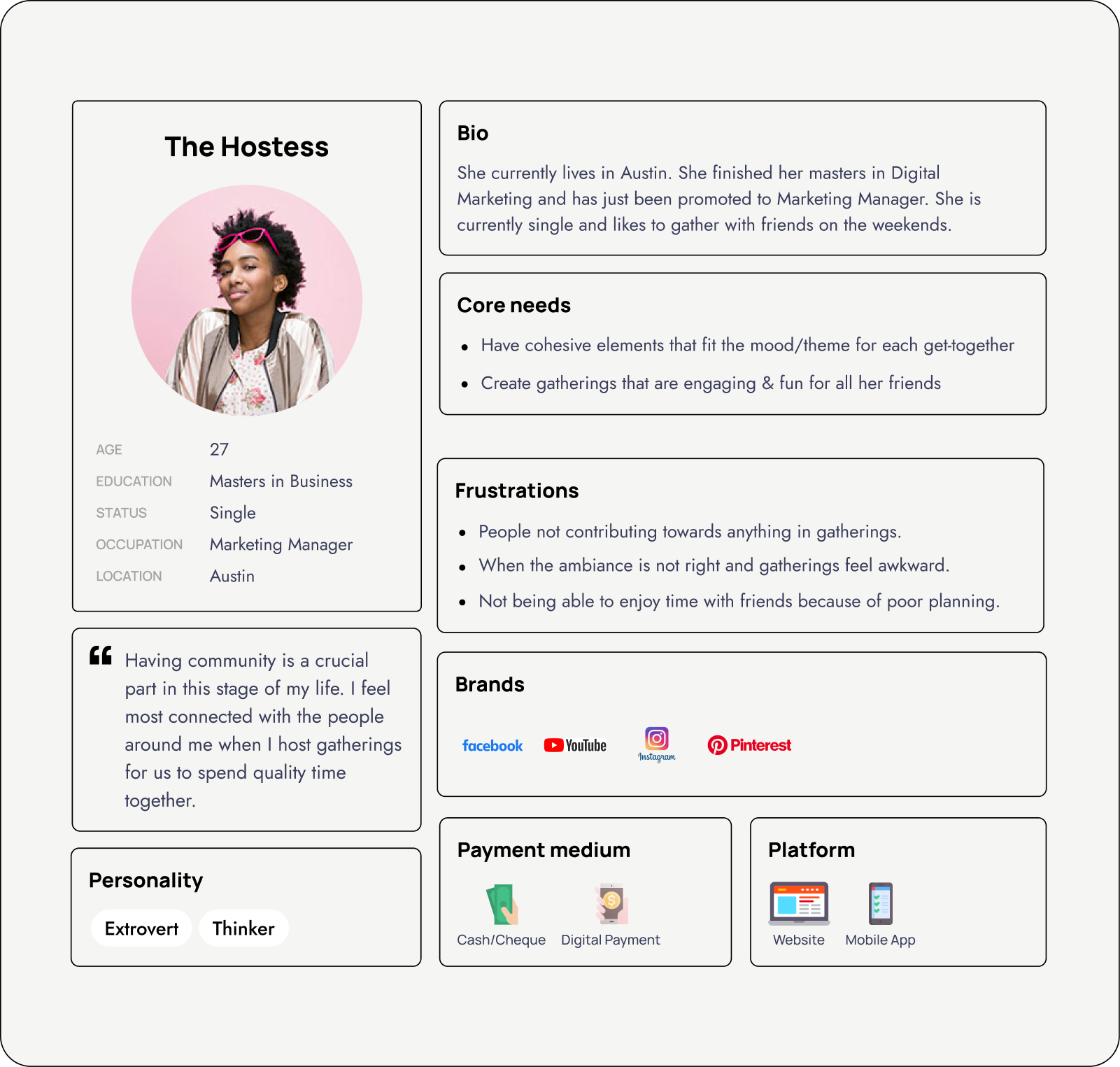
Our user: The Hostess — a 27-year-old marketing manager in Austin who loves bringing friends together but struggles to make every gathering feel cohesive and fun for everyone.
Pain Points
Planning is difficult. Hosts want all guests to have a great time. Poor communication around attendance affects planning. Guests feel anxious about not connecting.
Hypothesis
If we make the planning aspect easy and enjoyable, people will feel more fulfilled and connected to those around them.
Necessities
Good ambiance (music, energy, atmosphere). Food and drinks for all guests. Themes that bring people together. Easy, frictionless planning.
User Persona — The Hostess
03 — Ideate
Two flows, one big insight.
We explored two approaches to the core planning experience and tested them head-to-head:
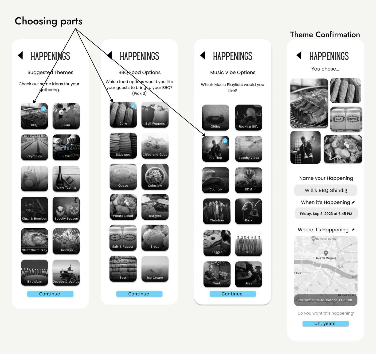
Wizard Flow
Step-by-step guided planning — structured, predictable, easy to follow. Users set size, theme, date, location, and invites in sequence.
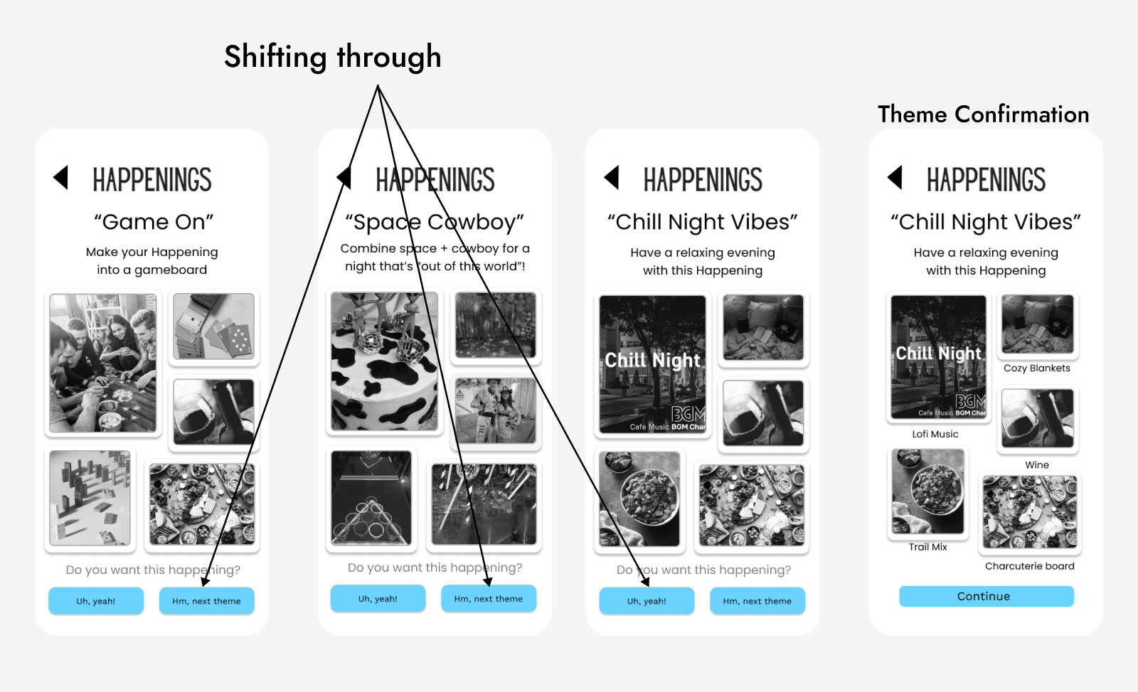
Random Flow
AI-generated theme suggestions users swipe through — more playful and exploratory, but less control for the host.
Testing Results
6 out of 9 users preferred the Wizard Flow for its clarity — but loved the visual energy of the Random Flow's theme cards.
Wizard Flow — Choosing Parts
Random Flow — Shifting Through
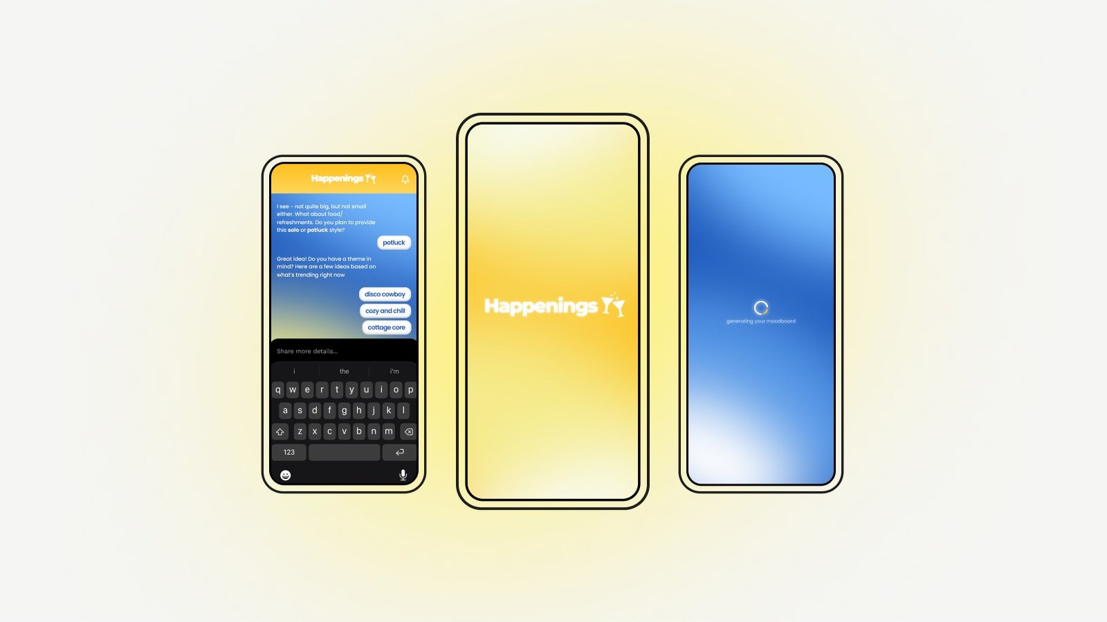
04 — Design
The final experience.
The final design combines the structure of the Wizard Flow with the visual delight of the Random Flow's theme cards — giving hosts both clarity and creativity. The app walks users through size, theme selection, date, location, and invites in a seamless sequence.
I'm cooking... stay tuned for the updated design ✨
Impact
Making it happen.
Happenings removes the barriers to social interaction — encouraging people to engage more actively in their social lives, cultivating belonging and community in the post-pandemic era.
Reflect
What's next.
Our research pointed to one clear next step — building the guest experience. The current app is host-focused, but guests need their own flow too.
- Build a "Hybrid" workflow combining the structure of Wizard with the visuals of Random
- Develop a full collaborative guest experience feature
- Explore AI-assisted theme and activity suggestions based on group size and preferences
 BANCOD